The packaging of a food supplement is one of the most important elements of the entire product. In many cases, it is the packaging that decides whether a customer clicks on an offer, reaches for the product on the shelf or adds it to their basket. Even the best composition cannot defend itself if the packaging does not attract attention or build trust.
Packaging design should not be seen as an add-on to the product. It is an integral part of the sales strategy.
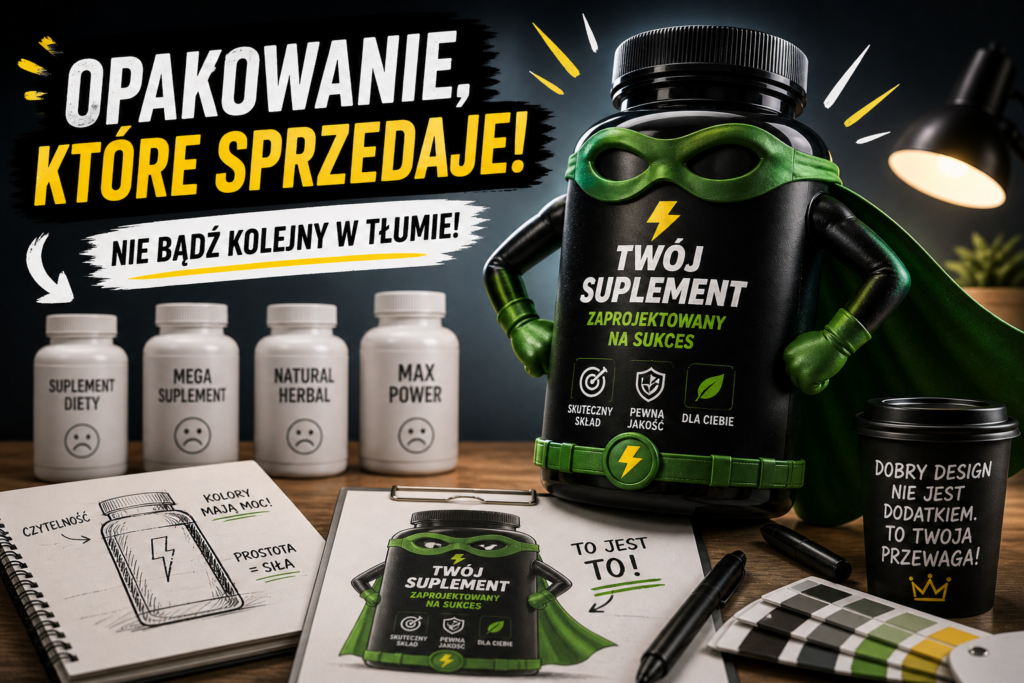
Packaging sells before the customer reads the composition
The customer makes a decision very quickly. In the first instance, he sees:
- colours
- design style
- the name of the product
- general appearance of the packaging
Only later does it begin to analyse the details. This means that the packaging has to:
- attract attention
- stand out from the competition
- clearly communicate what the product is about
If it doesn't, the client often won't even make it to the next stage.
Clear communication of product features
One of the most common mistakes is over-complicated or illegible packaging. The customer should understand in a few seconds:
- what the supplement is for
- what effects it has
- for whom it is intended
The simpler and more specific the communication, the greater the chance of a sale.
Consistency with the target group
Packaging must be tailored to the recipient. The product should look different for:
- athletes
- health-conscious people
- women
- the elderly
- premium customers
Each group has different visual expectations and different associations with product quality.
Minimalism vs. overload
Simplicity is increasingly winning out in the supplement industry. Overloaded packaging with lots of text and graphic elements loses out on legibility.
Good packaging:
- has a clearly defined point of focus
- does not overwhelm with information
- is legible even at a small size
- looks good both online and offline
Minimalism does not mean boring - it means controlling the message.
Packaging for online sales
More and more sales are taking place online. This is changing the way packaging is designed.
The design should look good:
- on product thumbnails
- on your phone
- in advertisements
- on the marketplaces
If the packaging loses legibility at a small size, sales will be lower.
Materials and form of packaging
The form of packaging also matters. The most common solutions are:
- bottles
- jars
- doypacks
- sachets
Each of these forms communicates something different:
- bottles and jars are associated with classics and stability
- doypacks are modern and comfortable
- sachets suggest mobility and ease of use
The choice of form should be consistent with the product and brand strategy.
Building confidence through packaging
In the supplement industry, trust is key. Packaging should build it by:
- clarity of information
- aesthetics
- visual consistency
- professional appearance
The customer must feel that they are buying a safe and high-quality product.
Consistency across the product line
If you are planning more products, the packaging should form a consistent line. This way:
- the brand is more easily recognisable
- products support each other
- easier to build sales scale
This is particularly important when developing a portfolio of supplements.
The most common mistakes in packaging design
In practice, several recurring errors can be observed:
- no clear product communication
- too much information on the front
- no differentiation from competitors
- mismatch with the target group
- design for large formats only
Avoiding these mistakes significantly increases the chances of product success.
Summary
The packaging of a dietary supplement is not just an aesthetic, but a sales tool. Well-designed packaging attracts attention, builds trust and increases conversions.
The experience of projects at Pharma Dot shows that brands that invest in thoughtful packaging design from the very beginning achieve good sales results and build market recognition much faster.


